Home › Forums › All Other Themes › Meditation Pro Mobile Color Sets
- This topic has 3 replies, 2 voices, and was last updated 4 years, 5 months ago by
Sonl Sinha.
-
AuthorPosts
-
November 5, 2020 at 8:11 am #168413
There is certainly a huge disconnect between the management of the desktop version of your themes versus mobile themes! After working with this theme for almost a year, there’s really no way to control what happens with the mobile theme other than coming here and asking for help.
I would be super happy to be able to change the color of text for backgrounds, text and headers. By default they are downright not readable. If you can give me the CSS to set mobile backgrounds to white and text/headers too black. From there I can probably figure out the different hex codes to play with those colors a bit more.
The site is http://capricornhealthcareconsultants.com
Here’s a visual of a page made in the standard WordPress classic editor:

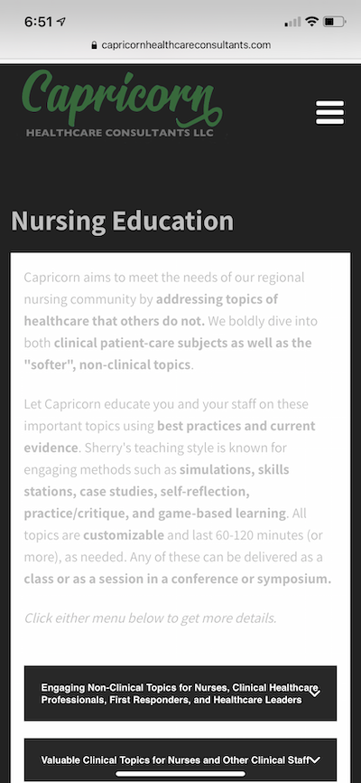
The leaders are somewhat invisible!Here’s a visual of a page made in SKT Builder using the accordion block:

All text is too light.Hopefully the fix there won’t break the accordions!
Thanks
November 5, 2020 at 12:48 pm #168474Hi,
Kindly go to Appearance >> Customize >> Basic >> Scroll down to find Custom CSS and paste there:
@media screen and (max-width:479px) {
.single_post_content {
    background: #fff;
    padding: 0 15px;
}
.single_post_content h3 b, #content .page-title, .single_post_content h2 b, .single_post_content p {color: #282828 !important;}
}
Regards,
ChrisNovember 5, 2020 at 4:18 pm #168488Okay that took care of 90% of the issues with the mobile site.
There are some pages built with the Classic editor that use bulleted lists where the text color is still light gray on white. That only is in the parts of the post that are list formatted.
See this page on a mobile device as an example:
https://capricornhealthcareconsultants.com/what-others-say/
Thanks for guidance.
November 6, 2020 at 10:45 am #168559Hi,
Kindly use this CSS as well.
@media screen and (max-width:767px) {
#content .single_post_content h3 b, #content .page-title, #content .single_post_content h2 b, #content .single_post_content p {color:#282828 !important;}
}
Regards,
Chris -
AuthorPosts
- You must be logged in to reply to this topic.
