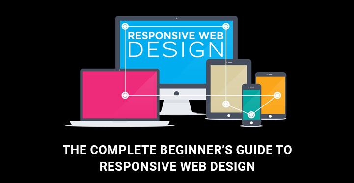
In our guide to responsive web design, we’ll discuss the most important points of a mobile-friendly approach and will accompany you through the basic process of making your site responsive.
Table of Contents
With a massively growing number of mobiles and other portable devices having access to the Internet, creating and running a responsive website has become a necessity.
What is responsive web design?
Responsive web design is the design of web pages to provide an excellent user experience on all possible sizes, devices, and screen resolutions. This design strategy will let any site automatically adjust itself to any target mobile or device resolution for the sake of the premium quality look and feel of your site across all of them.
The principle behind this guide to responsive web design is that any modern and professional website should be elastic enough to undergo certain changes to match any screen size and resolution. Overall, it is an excellent solution for displaying a website correctly and accurately on different screens.
Why is it important?
Remember the pixel-perfect images you see on the screen of your smartphone, collapsible menus, or rearranged color structures? These are all examples of the modern and demanded mobile-friendly or responsive web design.
But you can confess, that you don’t praise the authors of the site who have done their best to provide you with an unsurpassable mobile user experience, because it’s quite natural for you to enjoy the flawless performance of the site’s mobile version.
But you will certainly feel irritated and in all probability will leave that website after several seconds if it fails to be convenient in usage and legible when accessed by your smartphone or tablet.
The same is true with your audience. Neither of your web visitors will tolerate even a slight flaw or disparity in your site’s mobile version. Hence, making your website mobile-optimized and running smoothly. On them is one of the best strategies directed at keeping your customers on your website and inviting more of them at the same time.
However, this is not the only advantage you can make of the responsive design of your site. It’s one of Google’s lovely design solutions for contemporary websites. It means, that responsive sites are going to be ranked higher than those lacking this awesome functionality.
While counting the advantages of responsive web design, you should also note that it is not just about building a website that functions well when laid out on different devices. It is also about generating a website that is flexible and adaptive enough to render the true nature of a website without any distortions.
Now, that we have stressed the important points of mobile-friendliness in our guide to responsive web design, let’s pass on to the technical part of it so that understanding a responsive design will be less of a daunting task for you.
Now, let’s see what the main components of responsive web design are. There are three of them.
1. Flexible layouts
I am creating a site with a flexible grid to be rearranged and resized according to the screen size and dimensions.
This is the first step toward making a responsive layout. With such layout width or heights are not fixed. Everything is distributed in proportional percentages to match this or that device’s requirements. For example, if the browser is enlarged, your layout will respond accordingly and will span the required width.
Suppose you want to convert any fixed layout to the grid one. In that case, you’ll need to use your mathematical skills to divide the target by the context or use responsive design calculator alternatively.
2. Flexible Images
Images, first of all, as well as other media files integrated into your website also need to be resized accordingly as the device or its resolution changes.
Having flexible or responsive media files on your website is the next important point to note. If you have a fluid layout and your site’s images are not responsive, for example, you are going to have some discrepancies in the future.
One of the productive methods you can use to make images responsive is Adaptive Images. Use the CSS below to give an image a 100% width so that it will be able to adapt whenever the browser resizes:
img {
 max-width: 100%;
 width: 100%;
}
3. Media Queries
As soon as we have a flexible layout together with flexible media files, it’s time to bind it all together with the help of media queries. These are wonderful CSS settings that let the web browser which web sections will load whenever a specific device screen size is identified.
There are three media queries belonging to the phone, desktop, and tablet screen resolutions. The most widely used screen width settings to match these screen resolutions are 320px, 600px, 768px, and 1280px.
Here are some of the practical CSS media query breakpoints to be of much assistance to you:
/* Custom, iPhone Retina */
@media only screen and (min-width: 320px) {
/* custom styles */
}
/* Extra Small Devices, Phones */
@media only screen and (min-width: 480px) {
/* custom styles */
}
/* Small Devices, Tablets */
@media only screen and (min-width: 768px) {
/* custom styles */
}
/* Medium Devices, Desktops */
@media only screen and (min-width: 992px) {
/* custom styles */
}
/* Large Devices, Wide Screens */
@media only screen and (min-width : 1200px) {
/* custom styles */
}
Additionally, media queries are responsible for adding, moving, or hiding the content for each specific device so that its users can enjoy your site from top to bottom. For example, you have a specific button on your site and want it to be hidden for your smartphone users. You can use the following CSS to hide it only from the smartphone holders:
/* Smartphones (portrait and landscape) ----------- */
@media only screen and (min-device-width : 320px) and (max-device-width : 480px) {
/* Styles */
.button {display:none}
}

