According to HubSpot, 55% of website visitors spend less than 15 seconds on a site. But why should you care about these statistics?
Table of Contents
It’s because the longer you can keep people on your website, the more likely they’ll be to make a purchase. So, it’s important that you put time and energy into making your site as engaging as possible, so people will stick around.
In this article, we are going to take a look at some of the things you should know about website design, and provide you with six design tricks you can use to build an engaging website. Read on to find out more.
Add interactive elements to the top of your service pages
Adding interactive elements to your service pages can make them much more engaging. Most service pages can often be quite dry, but they are some of the most important pages on your website, so it’s important that you get them right.
When you add interactive elements to them, you’ll be able to capture your visitors’ attention and create a personalized experience that goes beyond the normal site browsing experience.
Some of the elements you could add to a service page include interactive quizzes, calculators, or sophisticated search features.
To give you some inspiration, let’s take a look at some examples of businesses that are already using interactive elements effectively.
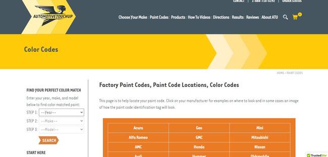
Take, for instance, AutomotiveTouchup, a company that provides touch-up paint for cars or motorcycles. They’ve helped to make their website particularly engaging with a sophisticated search tool that lets prospective customers find the perfect color match.
The tool allows them to select the year, make, and model of their vehicles so it can bring up the best color that would perfectly match the original.
Not only is this tool engaging enough to hold people’s attention, but it also helps to personalize the buying process for customers.
It’s a great technique that helps the company keep visitors on their site for a longer time and it is also likely to generate more conversions.
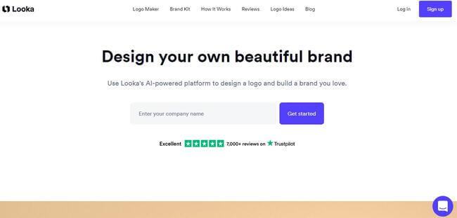
Looka also does something similar on their website. As a company that uses artificial intelligence to facilitate the designing of logos, they have created an interactive experience for their website visitors.
They simply ask their prospective clients for their company name, industry, brand colors, and slogan. With this information, their platform then generates a range of unique logos that can then be used as they are or customized.
The tool simplifies the task of logo creation and it increases the time that prospects will spend on the website. This is sure to be very engaging for people interested in Looka’s services.
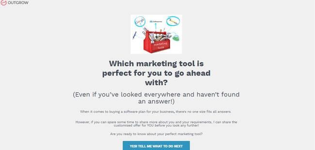
Lastly, we have this interactive assessment from Outgrow, a company that uses interactive marketing to help businesses increase engagement with their customers.
One of the interactive tools they have is an assessment that helps website visitors find out which marketing tools are perfect for their business.
The tool asks about your marketing goals, monthly budget, and the CRM tools you’ve used in the past. Based on the answers given, visitors then get a recommendation about the marketing tools they should be using to grow their business.
This is a very engaging tactic you can use to keep prospective customers on your website and it’s one that you should consider implementing.
Provide video content to grab your visitors’ attention
Video is one of the most engaging forms of website content. In fact, the Instagram Engagement Report from HubSpot and Mention even highlights results that show using video is the best way to generate engagement with your audience.
So, if you want to increase visitors’ dwell time and convince them to make a purchase, it’s a good idea to incorporate video content into the design of your website.
To make sure your videos are engaging, you need to figure out the types of videos that will work best for your brand.
You could create live videos, tutorial videos, behind-the-scenes videos, and even explainer videos. Just make sure you do adequate research and look into the trends you should follow when adding videos to your website.
Also, it would help to write out your video script beforehand. Don’t just dive straight into making a video — you should have a plan and make sure the dialogue is engaging enough to keep the attention of your viewers.
When you’ve created your videos, depending on their type, you can display them on different pages of your website.
For instance, you could create a video to introduce your staff and add that to the “about us” page of your site. Or you could also make a tutorial or demonstration video about your products and add it to your ecommerce page.
Now, let’s take a look at some websites that are using this tactic well to make their sites more engaging.
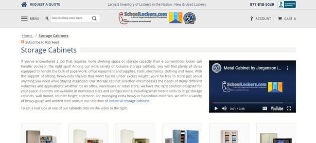
SchoolLockers.com provides different types of lockers for companies, schools, gyms, or other businesses. They also use different materials like metal, plastic, or wood to make their lockers.
On the service page for their storage cabinets, they’ve included a video that sheds more light on the metal cabinets they make for customers.
The video talks about the colors the cabinets come in, the types of shelves included, and they include a contact number for customers who might need more information.
Using video content like this gives them a chance to show off their products and it also helps keep people on their website for a longer period of time.
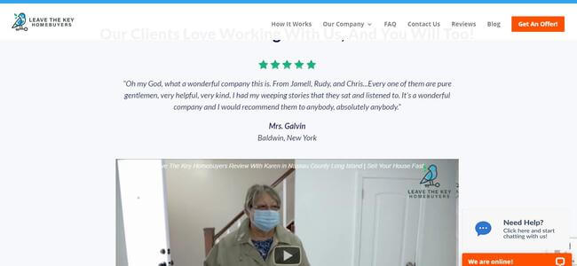
Leave The Key Homebuyers also uses video content to display reviews from previous customers. They are a company that helps people sell their homes fast in any condition.
On their website, they have a service page to inform people about the houses they buy in Buffalo, NY. Here, they have three video testimonials that show various customers talking about how pleased they are with the company’s services.
The clients also mention that they would recommend the firm to anyone looking to sell their property.
If you already have a system for collecting reviews, it could be worth asking future customers for video reviews that you can include on your website. This can help to make your site a lot more engaging.
Use imagery that humanizes your work
If people can put faces to your business, they’ll be far more likely to engage with you. Images can help you make a connection with your customers, especially if you use friendly faces or photos of people who look like your target audience.
It’s also a good idea to use high-quality images and not stock photos because people will be able to tell if you’re using recycled photos that have no real connection with your business.
It’s vital that you take steps to ensure your website images are optimized, too. One of the ways you can do this is by compressing the file sizes, as this will help your site load faster. To do this, you can use image compressor plugins or tools like Img2Go.com.
You can also check out this guide from SKT Themes on methods for optimizing images on your website.
Let’s take a look at a practical example of a business that uses images that humanize its brand.
Warby Parker is an e-commerce store that sells eyeglasses, sunglasses, and contact lenses. When you get to their website, you’ll see an image of two young adults on the homepage and the models are both wearing the same kinds of eyeglasses you can get from the store.
They also display images of different models who look just like the company’s target market on several other web pages.
Doing this helps prospects to form a connection and engage with the brand because they can see pictures of people who look just like them all over the website.
If you’ve also identified your target audience, it can be a good idea to use images of people who look like them on your website to attract the most engagement.
Create space for your previous customers’ experiences
Sharing reviews and testimonials from your previous customers can help make your website more engaging. This is because people love to read word-of-mouth recommendations to get a realistic idea of what they want to invest in.
To display your reviews, you can consider placing them in a section on your homepage or service pages. You can also add them to your website’s sidebar so people can see them as they scroll by.
Alternatively, you could create a separate page for reviews to display more testimonials from your customers.
Let’s take a look at an example of a website that does a great job of displaying reviews and testimonials to promote engagement.
Victoria University offers an online Master of Nursing program. And, on the web page for this, you’ll see that they’ve included a section where they display different reviews from past students of the school.
They talk about their experiences and how attending the university has shaped their thinking and career paths.
This is a great way to engage prospective students with real testimonials from the university’s alumni and it helps improve the school’s credibility.
If you also want to display reviews on your site but aren’t sure how to collect them, you can read this guide from SKT Themes that outlines which plugins you can use to get reviews and testimonials from past customers.
Keep your design simple but eye-catching
It’s important you find the right balance with your website design — you don’t want it to look so messy that people feel overwhelmed and leave, but you also don’t want to make it boring.
You could include plenty of imagery to keep things interesting and try to use the best colors for web design that reflect your branding. You should also keep your copy short and sweet and make sure you’ve created a user-friendly navigation for your website visitors.
Let’s study an example of a website design that’s very engaging.
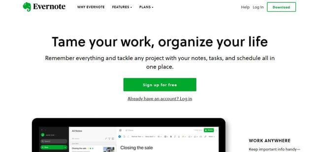
Evernote is a note-taking application that helps people capture all their ideas. On their website, you’ll see that they’ve gone with a very simple but effective design. They use the colors green and black, while making good use of whitespace.
They’ve also included plenty of high-quality images and videos of their tool to show prospects how it works.
Instead of filling their website with complicated designs, they’ve opted for a more simple one without clutter, which can help keep people on their website for longer.
If your website has too many elements and looks a bit cluttered, you might want to consider making it simpler so visitors don’t get confused.
Always ensure people know what to do next
You don’t want people to get lost on your website — instead, it’s important you make it clear what they need to do next at every step. And you can do this with effective calls-to-action (CTAs) that use strong command verbs.
You can also create visually effective CTAs using bright and bold colors that are different from your background so the CTAs can stand out.
Now let’s study how a particular website uses effective CTAs for inspiration.
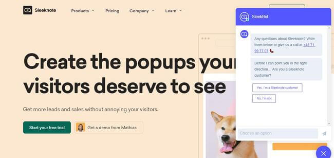
Sleeknote is a company that provides marketing software that lets businesses personalize their site so they can convert more prospects. And they’ve made their homepage engaging by providing two different CTAs.
One is for the people who are ready to start a free trial, and the other is for those who still want to see a demo from the company.
Should visitors need any more information, Sleeknote has also included a live chat option that engages visitors and connects them to people from the company’s customer service team.
When you use effective CTAs that tell website visitors what to do on your site, you’ll be able to keep them informed and engaged, and you can increase the conversion rate of your site.
Summary
In this article, we’ve given you six different tricks you can use when building an engaging website for your customers.
We discussed the use of interactive elements, video content, a simple website design, and even the use of imagery that humanizes your brand.
And, if you want to keep getting tips and tricks on how to design your website, you can follow SKT Theme’s blog for more updates.
Author bio & headshot:
Alex Ratynski is the founder of Ratynski Digital, an online marketing consultancy that focuses on helping small and medium-sized businesses achieve their goals.
He set up his company after working as a local SEO director for a dental marketing agency, where he helped to turn clients’ ventures into thriving multi-million dollar businesses. He spends most hours strategizing SEO for his clients.


