With a minimalist approach, the customer experience is much better.
“Less is more” a real fact that works wonder when it comes to the modern world. Probably you have heard this phrase’s numbers of time in your life. This is a kind of minimalism philosophy that loves to stay in simplicity.
Table of Contents
However, in the modern era, minimalist is far away in human nature. But you may love to hear that this taking the creative field into a peak.
Minimalist web design is simply referred to as produce simple and best user-interface, which can increase the experience of the user.
This technique can remove the super flaws of the website and takes the e-commerce business into the faster track.
So, if you are also interested in using minimalist for better your website growth, leads, and conversion rate. The following are the tips may help you.
1. Make your brand presence strong
When visitor reaches your website, the first thing he noticed your brand. Hence, it should be best and positioned in the center that attracts your customer that he loves to search more.
In studies, we have found, most of the visitor takes a few seconds to judge the whole website. If your website looks are impactful visitors can search, otherwise, they move on to the next.
The other distractions you will need to check is homepage, page loading time, content, and empty spaces. By working on all aspects, you can target your audience for a long time, hence it boosts conversion rate.
The brand message is also important to check-out. With an effective tag line, you can attract your readers and convert them emotionally.
Make sure you are clear up with offerings and use a transparent viewpoint so your customer understands you easily. Use unique, simple and perfect layout and canvas to build a perfect brand image.
2. Give your user easy navigation
In minimalist web design, maximizing the user experience is important. It does not relate only with best layouts and brand image, you need to increase their usability too.
On the reports of Hubspot’s, we have found customers are looking for the best website that is easy to navigate and get what they want.
You should work with minimalist rules to make it simple so your website usability increases and the conversion rate goes higher.
However, it is quite difficult for you to develop. So left all these things on professional who can increase your user usability.
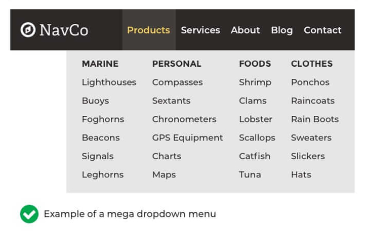
The other thing you need to work on organizing the categories easily so the user can search more with ease. A website with simple navigation, great content has great chances to work on the audience.
3. Keep your messages bold
While using minimalist web design, one of the crucial parts you need to look at is to keep your messages powerful with visual tools. A great way to come up with visuals to enhance your messages is to get the help of a professional web design company – you can click here to find a professional agency.
Don’t know what are visual tools? In website design, the visual tools are considered as a button, fonts, scheme, color theme and many more feature which you are using. All these visual tools need to be effective and especially impress your audience.
Might you be thinking, if this works, if you choose different writing styles or tools?
Your audience needs new and if you are doing this for them, so it would be good. Make sure things needs to be simple and creative that looks awesome. However, typography and applying minimalist is a work of art.
In the year 2018, the serif font made come back on minimalist websites, which were not used since 2018. You do not need to bother yourself too much, just choose two good fonts that suit your website and brand.
4. Select the pictures smartly
Adding pictures in your content is one of the best SEO tactics to boost the conversion rate of the website. Well, again there minimalist web design rule applies “less is more”.
This means you need to put fewer images but all need to be perfect and suit your website. Make sure you are using a high-resolution, perfect, and large image that directly relates to user emotions.
So to do all this, first of all, you need to go on self-discovery that as a customer what you expect. Once you know what you want, you can go smoothly and establish your brand accordingly. Pick the pics that attracts the audience and give the position to your brand.
Pro tip- while choosing images make sure that relates to your content and speaks for your content. This is all that minimalist web design needs.
Minimalist web design – A practical approach
May you not happy with a minimalist web design idea, but if we think practically this is a worthy deal. Well, you have numbers of the audience to target and everyone has own preferences and way to take things.
But the actual reason why minimalist is trending this year is it boost the speed, usability and conversion rate of the website.
With a minimalist approach, the website significantly becomes easier to navigate that increase user experience which is crucial to reach the top position in search engine and better the conversion rate.
Also, they come with high conversion website designs that can accessible by everyone at any time with any gadget.
If you are creating a website, you only approach is to make your brand image strong so you could earn large profits. And this is what you get form the minimalist rule.
The other factors you will need to consider are explained above. Follow up all the points and improve the conversion rate of your website.
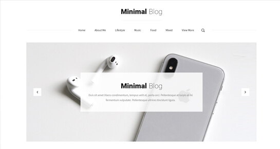
Check out our minimalist blog WordPress theme.
Wrapping up
Minimalist requires the attention to everything from your website design to its fonts to its content. This is working till the date, but all you need to take care of your audience and give them what they need.
In this modem era, the only thing which matters is improving customer satisfaction. If you are doing it great you have all, or if you are lacking anywhere you are losing your customers. Minimalist web designs are these which wok on user experience.


