Use Colors to Improve Click-Through Rates
The past few years saw quite a lot of discussion over the impact web design has on KPI metrics that affect a business’ bottom line. While some argue for the adoption of widespread web design trends, others believe that brands have to innovate to achieve success.
Table of Contents
But, there’s been one constant in all of these debates: the opinion that use colors to improve click-through rates and conversion rates.
Some are, of course, familiar with the concept of color psychology. It famously emerged in the 19th century and was championed by German artist Johan Wolfgang Goethe. But, since the early 1800s, it has progressed quite a lot, with empirical data testifying of its influence.
Today, the role of color in shaping human behavior isn’t just a philosophical concept, but more than that, it’s a popular branding strategy. And, relevant to today’s topic, it’s an effective tactic for boosting website to use colors to improve click-through rates and conversion rates.
So, if your goal is to grow your bottom line without having to go through a complete redesign, these are the ways you can use color to improve your website’s KPIs.
Infusing Meaning
The most basic way you can use colors to improve your business’ performance is to start with your visual branding. By developing and consistently using a set of design rules, you’re doing a great deal to move your venture forward.
Firstly, by using certain colors, you’re actively influencing the impression consumers have of your brand. For example, it is believed that companies that want to come off as reliable and authoritative will want to use blue in their color palette.
Orange, on the other hand, is thought to signal happiness or adventure. Thus, it is best applied by those who want to come off as exciting and daring.
Secondly, consistent visual branding doesn’t just communicate meaning and intention, but it also helps your brand become synonymous with the values you promote.
So, for example, if your business stands for green living and promotes the use of natural ingredients, you can go with a subtle and natural color palette, like the one used by Evolve Organic Beauty.
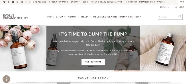
image source: evolvebeauty.co.uk
This brand combines light neutrals with feminine pinks and earthy greens, helping each of their website visitors understand what they can expect when shopping with the company. Ultimately, this positively impacts conversions, seeing that the website sends a unified message both with text, color, and imagery.
Aesthetic Appeal
In addition to meaning, it’s also not a bad idea to consider that a visually coherent website – that is, one that uses coordinating colors – is going to perform better than one that’s a mixture of random aesthetic choices.
In a now-famous report by Adobe published in 2015, statistical data showed just how important great design is for click-throughs and conversions.
The report states that 7 in 10 people prioritize content that displays well on their device, and 68% will choose to consume beautifully designed over plain content. What’s more, if a page is unattractive, as many as 38% will stop engaging altogether.
With this in mind, designers need to have a strong command of color theory. Furthermore, they need to be capable of putting together aesthetically appealing palettes.
Fortunately, free color wheel tools can help with this, ensuring that the final result looks and performs as expected.
A great example of a brand that uses the color wheel to its advantage comes from Eachnight. The Mattress Guide page displays the same hues used in the logo but arranged to highlight and contrast.
So, the main image and CTA buttons use the same shade of magenta, creating a cohesive whole that’s aesthetically pleasing to look at (and more likely to keep visitors engaged).
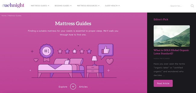
image source: eachnight.com
The Readability Impact
One thing to keep in mind when choosing the colors for your website, landing pages, and social media accounts is that you will have to pay attention to contrast and readability. Especially when it comes to high-value elements, such as sign-up forms and CTA buttons.
To boost click-through rates and conversions, pay attention to visibility and contrast. High-value elements will need to be placed in the most visible spot, and they will have to stand out from the background.
For example, blue and yellow hues work well together, which is why All for Paws uses the combination generously in their hero section.
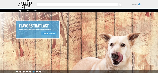
image source: allforpaws.com
Other elements to consider will be typography (font and text size), as well as UX-oriented factors like layout and technical site performance.
When to Skip Color Altogether
Finally, although color can have a hugely positive impact on your CTRs and conversions, don’t feel like you have to go over the top to achieve great results. Instead, think about color in terms of an element that can enhance web design that’s already great in itself.
If you look at minimalist web design, you’ll see that it works because of two reasons. Firstly, it uses ample white space to allow important web page elements to stand out.
What’s interesting is that this negative space doesn’t necessarily have to be white, as you can see in this example by Margeaux & Linda’s Vegan Kitchen.

image source: mlvegankitchen.com
Secondly, minimalism is an excellent way to prevent decision fatigue in users, especially when describing products or listing features. As you can see, the Solutions page by Snapwire manages to cover plenty of services the company offers, all the while keeping things simple and scannable.
This doesn’t just look better than a jumble of elements – it also boosts UX, ultimately helping move users along the sales funnel towards converting.
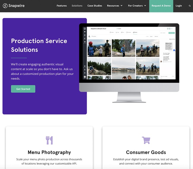
image source: snapwire.co
Last Considerations
There are many tricks to effectively use colors to improve click-through rates and conversions. But, the final ingredient to a revenue-boosting website is always going to be the testing phase.
Don’t forget to always check how your design changes impact KPIs. Yes, color psychology and theory may tell you that green signals go, which should mean that it’s the ideal choice for CTA buttons. But empirical data shows that this doesn’t always have to be the case.
So be vigilant about testing and always put things into context. In the end, there’s no formula for visual branding. Instead, what you have to do is find the best choices for your business, ideally with a stellar design team backing you up.

