What makes a good website an excellent commercial website? Conversion rate. The bigger it is, the more beneficial it is to your website.
Table of Contents
We all know that search engine optimization is vital when it comes to boosting the traffic of your website.
It means that well-written content will only boost you in social engine ranking and bring more visitors as a result. No matter how optimized your texts are in terms of SEO, you will earn nothing, if your website does not have any conversion rate.
In this article, we will discuss several ways to boost website conversion rate with the help of web design.
Make it optimized
By now, the use of the Internet has shifted from computers to cell phones and tablets. As a result, it is not worth creating only a desktop version of a website, if you want it to have a good conversion rate.
You need to pay particular attention to the fact that various devices have different screen orientation and resolution. Moreover, some fonts are not supported by mobile phones.
So, if you don’t want your visitors to close the tab as soon as they enter your website from a mobile phone, you want to make all pages optimized.
There is an excellent website audit tool called Sitechecker Pro that could help you realize which aspects you should improve on.
As we all know, not optimized images can harm websites. First of all, they affect the website speed and can significantly slow it down. To prevent website from slow loading you always need to check its sizes and impact on website speed.
How low website speed will affect the site and conversions?
75% percent of users won’t be waiting for your webpage is completely downloaded. They will leave your site and thereby increase the bounce rate. So you will lose not only the potential customers, but also decrease your website performance for search engines.
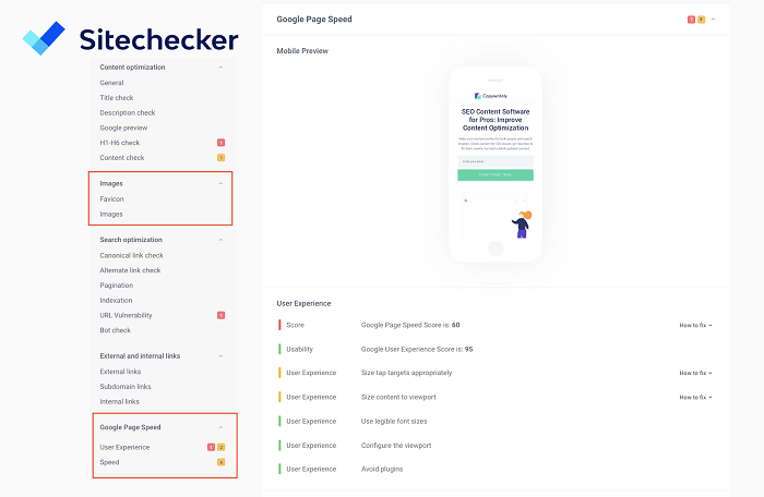
Here is the example on how to test if your images are optimized enough using web crawler :
You may see how your webpage can be shown in mobile on desktop versions. And what score of Google Page Speed test you may have.
User-friendliness
Another thing you’d probably want to ensure is the user-friendliness of the UI. It means that there should be no irrelevant information that could distract users, no irritating gifs or pop-up windows.
In this case, it is best to ensure that a user has an outstanding experience visiting your website. As a result, visitors are more likely to buy from your platform.
Right color palette
This one is pretty straightforward, I assume. However, to choose the right color palette, you need to learn how colors affect users’ mentality.
It would be an excellent idea to know the associations between colors, what emotions they breed, and how you can combine them to achieve the desired result. Have you ever noticed how attractive and pleasant Apple Inc. website is?
If not, then you should probably go and check for yourself. A light color palette of their store makes visitors subconsciously feel safe, and consequently, they are more likely to buy another expensive gadget.
Content placement
This is a vital aspect to remember, too. As a web designer, you should understand how a user behaves at the webpage, and place the content accordingly.
A simple rule would be a header with the navigation panel at the top, some essential links or similar stories on the right, and a ‘Contact us’ at the bottom.
This is when content and design intertwine to boost website conversion rate. You need to strategically plan out the content placement when adding visual support.
Readers pay less and less attention as they scroll towards the bottom of the page. You’d want them to remain interested and focused at the same time.
Call-to-action
This is an obvious, yet a challenging thing to implement. The biggest problem is to choose the right place for a call-to-action.
Typically, it should be in the concluding part of the content, but you may want to make it stand out from the rest of the text.
If this button or a piece of a text catches readers’ eye, then they will be forced to read until the end and realize why they do or do not need your product.
Still, a greatly formulated and an eye-catching call-to-action dramatically boosts the chances of successful conversion.
Conclusion
It is understandable that a piece of well-written text is not enough to contribute to boost website conversion rate. Website design is an integral part since it appeals to human emotions and subconsciousness.
So, make sure that your website looks good and is user-friendly. Do not forget to include the call-to-action at the right place, and arrange the content of your web page in a way that would be convenient for the readers to perceive.
Finally, you do not want to forget about cross-platform optimization in modern circumstances, when more and more people tend to surf the web using their mobile phones or tablets.


