Web Design Psychology
Design, Colors, fonts, and writings on a website have a great influence on the minds of visitors and clients. Web design psychology means having knowledge about clients need and requirements.
Table of Contents
Understanding consumers’ views towards the product and services and making the website according to help the owners get clients.
The creator of the website focuses on the typography, colors, and font that are related to the subject of the website. The idea and belief of the owner is the main focal point of the website and design is the secondary but most important element to attract people’s attention on the page.
Appealing Colors
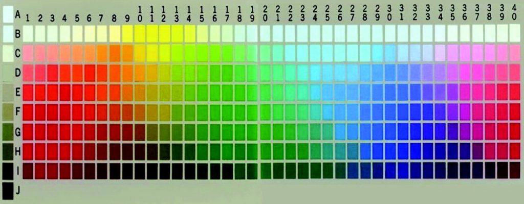
We all know colors play a significant role in building a website. Colors have different meanings and they are used differently in the web pages to convey the idea.
Colors can make a webpage attractive if used properly as well and they can make a thing less appealing if not used effectively. Psychologists call it Color Psychology. On websites, different colors are used to serve different purposes.
Warm Colors
Warm colors like red, yellow, and orange symbolize energy, passion, positivity, and happiness. Red is also a color used as a danger sign or warning. But the meaning of this color is different in different places in China people believe it shows happiness and prosperity.
In Africa color represents mourning and it is also associated with communism, so red is a very versatile color to use on the website according to the web design psychology.
Orange is an energetic and vibrant color associated with seasons like autumn and creativity. In web designs, orange has a strong influence on the people. Sometimes this color is considered inviting and friendly.
Yellow is the brightest color and symbolizes energy. It is a sign of sunshine and happiness. But calling someone yellow means the person is a coward.
In some countries, this color is a symbol of danger and in some countries, it is also a symbol of hope. In Japan it represents courage, in India, it is associated with merchandise and in Egypt, it is a color of mourning. In web design, it is a color of cheerfulness and happiness.
Cool Colors
Cool colors like green, purple, and blue are colors of nature, night, and water. These colors are usually calming and relaxing. Nature’s color is green while blue represents the color of the sky and water.
Green represents life, nature, and trees. It also shows growth and a new beginning but in some cases it symbolizes jealousy. In web design, green is a color of wealth, nature, stability, and renewal. Dark green is the most influential color, bright green represents vibrancy and energy.
Blue is a primary color associated with poison in science and sadness in English literature. Light blue is a sign of friendliness and refreshment. In some countries, it is believed as a color of responsibility and calmness. Since ancient times this color has been associated with religious and spiritual connotations.
Purple is a color that was extracted from snails in ancient times. It was a color symbolizing royalty, it was believed that only wealthy people could afford and use this color. This color is a mixture of red and blue. In some countries, this color is associated with imagination and creativity.
But in Thailand, it is a color of mourning for widows. Purple mainly the color of lavender is considered a romantic color. In web design psychology it is a color of luxury and wealth. Light purple represents a romantic mood and spring.
Neutral colors
Neutral colors like black, gray, white, and brown are mostly used as background colors. Black is the most powerful background color used in designing websites. It is associated with formality, elegance, and power. On the other hand, it is a sign of death, evil, and mystery. In Western countries, it is a color of mourning. Black is also used on Halloween a famous festival in Western countries.
It is considered as an elegant and formal color so in web designing it gives the visitor a sense of sophistication.
Gray is a color used to show a depressing mood and moody nature but mostly it is a color that shows formality and conservatism. Apart from black and gray, white and brown are also used as background colors in website design.
Typography
While creating a website it is important to choose the right typography and font. Font style shows the seriousness of the text as well as the importance of the website content. Message written in a very bad font lowers the quality of the website and makes it less appealing to visitors.
Visitors feel uninterested and misunderstand the tone of the writing. In web design psychology fonts play a vital role in conveying the message. Other than fonts, font size, spacing, and contrast make the content visibly appealing and attract clients.
Layout Design
Along with the font and colors, the layout brings everything together in a website. Layout is a form of art to puts everything in the right place and creates a unique design. From the font, color, logos, buttons, social media share buttons, and search bar everything plays a pivotal role in web design.
To make things easier designer focuses on 5 important segments:
- Size
- Position
- Color
- Format
- Relation between the elements
These five focal points help to create a beautiful and well-organized layout for a website. On a website, every inch should be perfect and well organized. A website congested with pictures, options, and buttons confuses the visitor and he or she leaves the page immediately without looking further.
Guiding the visitor with your layout design is important to attract his attention. From the top to the end of the website, every little thing matters. In the study of web design psychology, designers say that visitors are attracted by both the design and the content of the web page.
So make sure you engage your visitors with good content. The content can either engage them or confuse them. Now it depends on you how you choose the layout design.


