Most people on the internet respond most positively to visual cues, thus the popularity of videos. The boon of websites like YouTube and private hosting site such as Cincopa is definitely illustrative of this.
Table of Contents
For that reason, marketers are being urged to use more and more pictures and videos on their websites.
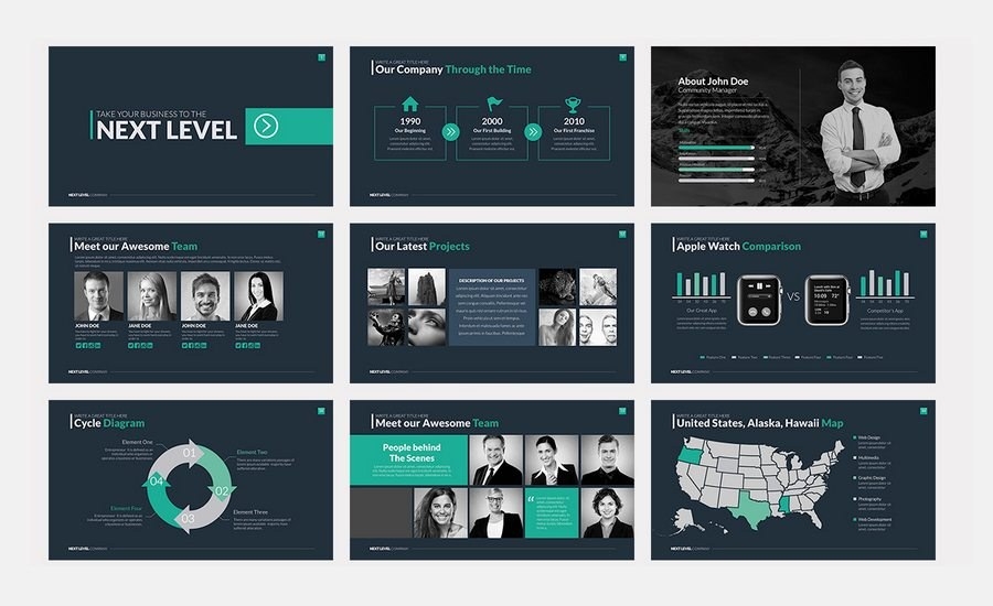
Image slideshow galleries are simply a different take to having still images on your website and would suffice just as well as an image or a video in its place.
According to content marketing site Social Media Today, Slideshare is one of the most trafficked websites today.
This is perhaps the most concrete example of how rapidly and subtly sliders have crept into our online lives. So, what makes image galleries such as these so beloved?
How having a slideshow affects your website
1. Increased user engagement :
The human eye is greatly adapted to monitoring and filtering out any moving objects, whether on a screen or in real life.
That’s why, for instance, a navy seal wearing camo and standing still in an image is a lot harder to spot than one running across the screen. Pretty much the same concept applies with regard to any product.
As Google suggests, ‘it’s all about meaningful motion.’ The kind of movement so provided by moving gallery sliders makes it a lot easier to capture a user’s attention. This sense of action will keep the average site visitor engaged for quite some time.
Besides, considering how much of the human senses depend on sight, they present the opportunity to display more than one image at once. This is an especially important concept when it comes to the on-screen real estate.
Instead of showing just one image, show a perfect balance of them to create a combination of great visuals.
2. You get to show all your great products immediately :
High bounce rates are the kind of thing that can keep a great marketer up all night wondering what the problem is, exactly.
Nine out of ten times, people don’t feel engaged because they have to dig through troves of content to find what they want. Gallery sliders break this barrier down by allowing you to break the rapport with the user almost immediately.
For this to be even more effective, update slideshow in website with different images as often as you can. Imagine releasing a single blog post and then disappearing off the face of the earth? It wouldn’t be a great way to get people to keep coming.
Similarly, a slideshow sin Website hould constantly be rotated. The more content you create, the more people visit, and the more likely you will retain the users you already have.
3. They provide an excellent opportunity for analytics :
Another great advantage of having a gallery slider on your homepage is the chance to collect some pretty comprehensive pieces of analytics data.
Via these, you can track the number of views each page of the presentation gets, and depending on how you plan to handle the data, you can tell what content viewers are most interested in.
Not everything is black and white, and there’s a fair chance your customers aren’t like the average customer.
Once again, it’s also the best opportunity for some A/B testing. Using referrals, for example, a sample of users can be sent to the site with the slider and another to the regular website that doesn’t feature it.
Each of these users can have their bounce rates and other such relevant data recorded, and whatever needed adjustments can be made.
4. They’re easy to digest :
Not everyone has enough patience to read lengthy heaps of text describing what your business does, detailed descriptions of every product in your inventory and lengthy blog posts.
Slideshows are the perfect solution to simplifying everything via short text of summary. Even incredibly detailed and complex ideas can be converted into short-format text that users can ingest and digest in a short time.
Even better, if a visitor wants to go back to something they have already passed, there’s no need to go through the whole thing all over again.
A decent slideshow should either contain page numbers or little dots at the bottom indicating the current page and for navigation.
If they are only interested in one part of the slideshow, they can skip all else and concentrate on what brought them to your site.
5. SEO :
At the end of the day, everything we marketers do is for the sake of search engine optimization, which is an excellent way to bring more visitors to your site.
When a user spends more time on your site, it’s a nod towards search engines, indicating the content on your site is relevant.
Depending on your implementation, then, an image slider could do some good concerning image SEO.
Additionally, since it’s the first thing a user sees when they visit your site, it’s a great place to put a call-to-action. It’s crucial to remember that a good CTA gives the users a good reason to click on your link.
At the same time, it should also give them a reason to explore your site a little further. You could do this by, for instance, giving more information about your company or present them with some offer.
Once again, this is a great strategic move to keep the visitor on your site for those precious extra seconds. All the while, use the right keywords in every page of the slideshow to improve your search engine rankings even further.
Conclusion :
Gallery sliders can be a very useful tool, given they are implemented correctly. They provide your business with the chance of improving your SEO rankings and greatly increasing user engagement with your website.
When having them on your site, however, remember that you should never use too many images, too many animations or more than one slider on the same page. They tend to become intrusive and overbearing when overdone.
Author Profile:
Having more than 8 years of writing experience, Smridhi Malhotra is a professional tech, health and travel blogger. She loves to gather and share her profound knowledge about latest developments in technology.
Smridhi is a management graduate and visual graphics artist and is currently pursuing master’s in behavioral psychology. Her hobbies are practicing mindfulness, counseling children and traveling (a special love for Africa).


