Most people usually install an HTML table for storing crucial information and data. These tables also play an important role in constructing a webpage, especially the ones of the WordPress platform.
Table of Contents
Therefore, if you want to design your website proficiently, then you would, first, have to know about the methods of building responsive tables.
However, there are different types of HTML tables out there, which serve different purposes. Therefore, to help you to understand everything about them, here, we will be talking about the creation procedure of responsive tables with WordPress, CSS, and HTML.
What Are Responsive Tables and Responsive Design?
If you want to know more about the responsive tables, then you would have to understand the term ‘responsive design’. It is a type of design, which is adjustable to different sizes of screens.
With a responsive table, the users of smaller screen devices will be able to go through your data quite comfortably.
What are the Patterns of Responsive Tables?
Since the responsive design was introduced, building responsive tables became quite difficult for almost everyone. As the data tables generally come with a wider size, you should always keep the data of a single row together to make it easier to understand. Here are three patterns that can help you with it.
1. The Priority Tables
The priority tables have the ability of hiding screen on the low-sized displays. The tables made with this formation generally look quite beautiful and visually aesthetic. However, if the excluded fields were the most important ones, then this pattern can be somewhat problematic for you.
2. The Horizontal Overflow
The Horizontal Overflow pattern can help you and others to see the data of a table quite conveniently. For that, you would only have to scroll to the right and left of the screen. In this pattern, the first field generally stays at a fixed position. So, you can see the other parts of the table only when you scroll through it.
However, there is a catch to it. If you do not know or understand that the table is scrollable, then you will not be able to see it appropriately. If it happens, then you might miss out on the crucial parts of the table.
3. The Transitional Table
If you want to avoid the hassle of scrolling while reading or building responsive tables, then a transitional table can be the best solution for you.
With this pattern, you can make the table in a row format instead of opting for a column structure. Therefore, it becomes easier for the viewers to watch the whole content efficiently.
Unfortunately, there is one downside to this pattern too. You cannot do field comparison or scan with a transitional table.
How to Make Responsive Tables?
You can make a responsible table in numerous ways. Here are some of them.
Collapse by Columns: If you are thinking about making your table collapse by columns, then you would have to alter the markup or caricature with JavaScript. Therefore, before opting for this method, you would have to learn HTML properly.
Squash: If your table’s columns do not carry much information, then you can squash it horizontally. It will help you to avoid altering the whole layout of the table.
Collapse by Rows: You can split the rows of your table into several separate parts to make it look simpler and easier to read.
Vertical Scroll: If you do not want to change the structure of your content, then you can also opt for the vertical scroll option.
Things That You Must Avoid While Creating a Responsive Table
Since the beginning, people have tried several methods of building responsive tables. However, not all of them were particularly effective. Here, in this section, we will be talking about some of them.
You should never use JavaScript for creating narrower tables. It will eliminate all the unique IDs that you had included in your previously-made tables.
Do not use standard table markup and JavaScript altogether to rearrange your table. It requires several markups and DOM manipulation, which can be quite complex and difficult for you.
Besides these, you should also never keep the table switching and markup for display.
How to Build Responsive Tables for Different Platforms?
The following are some ways that can help you with building responsive tables on different platforms.
1. wpDataTables for WordPress
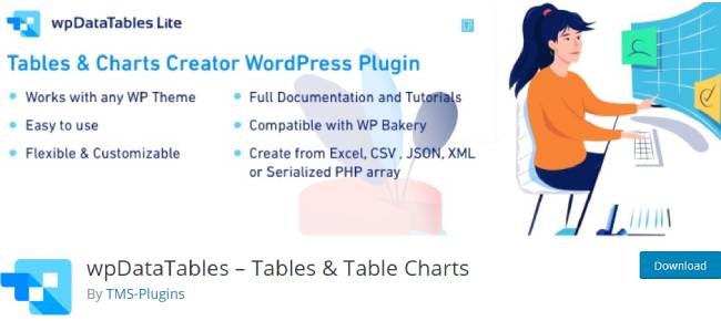
The wpDataTables is one of the highest-selling plugins for WordPress that can help you to work with data management, charts, and tables quite effortlessly. More than 17,000 companies and organizations are currently using this plugin to complete their commercial, financial, statistical, and scientific works.
2. Responsive Table for Foundation
If you want to create a responsive table for Foundation, then you would have to use the coding method. Here is an example of a responsive table that you can build on Foundation.
Now, if you want to this with the help of HTML, CSS, and JS, then you would have to use the following code in HTML.
Responsive Table with Foundation
<div class="row">
  <div class="small-12 column">
    <table summary="This table shows how to create responsive tables using Foundation's extended functionality" class="responsive">
      <caption>An example of a responsive table based on
<a href="https://zurb.com/playground/responsive-tables" target="_blank" rel="noopener noreferrer">Foundation</a>:</caption>
      <thead>
        <tr>
          <th>Country</th>
          <th>Languages</th>
          <th>Population</th>
          <th>Median Age</th>
          <th>Area (Km²)</th>
        </tr>
      </thead>
      <tbody>
        <tr>
          <td>Argentina</td>
          <td>Spanish (official), English, Italian, German, French</td>
          <td>41,803,125</td>
          <td>31.3</td>
          <td>2,780,387</td>
        </tr>
        <tr>
          <td>Australia</td>
          <td>English 79%, native and other languages</td>
          <td>23,630,169</td>
          <td>37.3</td>
          <td>7,739,983</td>
        </tr>
        <tr>
          <td>Greece</td>
          <td>Greek 99% (official), English, French</td>
          <td>11,128,404</td>
          <td>43.2</td>
          <td>131,956</td>
        </tr>
        <tr>
          <td>Luxembourg</td>
          <td>Luxermbourgish (national) French, German (both administrative)</td>
          <td>536,761</td>
          <td>39.1</td>
          <td>2,586</td>
        </tr>
        <tr>
          <td>Russia</td>
          <td>Russian, others</td>
          <td>142,467,651</td>
          <td>38.4</td>
          <td>17,076,310</td>
        </tr>
        <tr>
          <td>Sweden</td>
          <td>Swedish, small Sami- and Finnish-speaking minorities</td>
          <td>9,631,261</td>
          <td>41.1</td>
          <td>449,954</td>
        </tr>
      </tbody>
      <tfoot>
        <tr>
          <td colspan="5" class="text-center">Data retrieved from <a href="http://www.infoplease.com/ipa/A0855611.html" target="_blank" rel="noopener noreferrer">infoplease</a> and
<a href="http://www.worldometers.info/world-population/population-by-country/" target="_blank" rel="noopener noreferrer">worldometers</a>.</td>
        </tr>
      </tfoot>
    </table>
  </div>
</div>

<p class="p">Demo by George Martsoukos.
<a href="http://www.sitepoint.com/responsive-data-tables-comprehensive-list-solutions" target="_blank" rel="noopener noreferrer">See article</a>.</p>
Once you are done with it, then you have to write this code on CSS.
h3 {
  padding: 20px 0;
  text-align: center;
  font-size: 1.9em;
}

table {
  width: 100%;
  margin: 0;
}

table caption {
  font-size: .9em;
	padding: .5em 0;
}

table caption,
table tfoot tr td {
  font-weight: normal;
}

@media screen and (max-width: 766px) {
  table caption {
    display: none;
  }
}

.p {
  text-align: center;
  padding-top: 140px;
  font-size: 14px;
}
After that, you need to implement this code on JS to complete your task.
// responsive-tables.js
$(document).ready(function() {
var switched = false;
var updateTables = function() {
if (($(window).width() 767)) {
switched = false;
$("table.responsive").each(function(i, element) {
unsplitTable($(element));
});
}
};
$(window).load(updateTables);
$(window).on("redraw",function(){switched=false;updateTables();}); // An event to listen for
$(window).on("resize", updateTables);
function splitTable(original)
{
original.wrap("<div class='table-wrapper' />");
var copy = original.clone();
copy.find("td:not(:first-child), th:not(:first-child)").css("display", "none");
copy.removeClass("responsive");
original.closest(".table-wrapper").append(copy);
copy.wrap("<div class='pinned' />");
original.wrap("<div class='scrollable' />");
setCellHeights(original, copy);
}
function unsplitTable(original) {
original.closest(".table-wrapper").find(".pinned").remove();
original.unwrap();
original.unwrap();
}
function setCellHeights(original, copy) {
var tr = original.find('tr'),
tr_copy = copy.find('tr'),
heights = [];
tr.each(function (index) {
var self = $(this),
tx = self.find('th, td');
tx.each(function () {
var height = $(this).outerHeight(true);
heights[index] = heights[index] || 0;
if (height > heights[index]) heights[index] = height;
});
});
tr_copy.each(function (index) {
$(this).height(heights[index]);
});
}
});
$(window).on('load resize', function () {
if ($(this).width() < 767) {
$('table tfoot').hide();
} else {
$('table tfoot').show();
}
});
3. FooTable for Bootstrap
FooTable is a type of JQuery plugin, which can convert your HTML tables into responsive and expandable tables. It can hide some specific data columns at different resolutions, which, in turn, expands the rows and reveals all of their data. One of the best things about FooTable is that it also works without Bootstrap.
4. Responsive Tables for jQuery
Here are some of the tables that can help you in building responsive tables for jQuery.
With json Data: To make a table with json data, you would have to write down the following code.
<!-- Google fonts -->


<!-- Description -->
<h1 class="description">
  Responsive table with json data.
</h1>

<!-- Table demo -->
<div class="box-table">
<table data-fn="contacts" data-url="https://codepen.io/nakome/pen/DnEvr.js"></table>
</div>
Basic Table: Basic table is a lightweight and simple table library that can help you to build responsive tables for jQuery. It is a free tool and comes with a plethora of responsive table structures.
Material Design Responsive Table: You can use this table structure on several browsers, such as IE 11, Chrome 37, Opera 25, Firefox 32, and Safari 5.1.7. You can implement it in the Bootstrap projects too.
5.Responsive Tables for CSS:
If you are working with CSS, then here are some options that can be helpful for you.
CSS Flexbox: CSS Flexbox is a table layout module, which is specifically made for creating responsive tables with CSS.
Responsive Table: By using the coding methods, you can also create a responsive table with CSS. The layout of the table made by this method is adjustable, which can be great for the people who are viewing it on their mobile phone.
Simple Responsive Table: It is one of the best-known patterns for making responsive tables with CSS.
Conclusion
Most WordPress users generally consider this to be the era of responsive design. Therefore, to make your data easier to read and understand, you would have to keep the design of your tables responsible too. However, if you follow all the above-mentioned pointers, then you surely will not have any issues with your task.


