WordPress accessibility explanation and themes
Working as a web developer, especially on WordPress, is extremely rewarding. However, to get rewarded, it is very important for you to make sure that your website loads quickly, follows each and every SEO practices and is very responsive. In addition to these, you would also have to add a creative touch to your website to attract more clients and users.
Table of Contents
While designing your website, you should always keep your clients’ goals in your mind to provide them with pleasant working experience. However, when talking about user experience, most of the people tend to forget, or rather neglect, a very important thing, which is the accessibility of the website.
According to numerous reports, almost 50% of all the disabled adults use the internet regularly, and this percentage keeps growing day by day. Because of this reason, accessibility becomes very essential for those web developers who are thinking about providing all of their clients with satisfying user experience.
Thus, if you are feeling curious about WordPress accessibility and are looking for some more information on this context, then, make sure to check out the rest of the blog.
What is Accessibility and Why is It Important?
The term ‘web accessibility’ is used to represent some design techniques, which makes it easy for the people with disabilities to access the numerous features or items of your website. Thus, while trying to make your website accessible, you would have to keep in mind about the numerous types of disorders, such as visual, speech, auditory, cognitive as well as physical. Because of this reason, you would have to design it in such a way that it can adapt to your client’s situations, needs, and preferences. Another aim of web accessibility is to make your website accessible even to those users, who use mobiles and do not have a high-speed internet connection.
In short, web accessibility helps to make the internet a better place for each and every person. However, if you see it from the perspective of a businessman, an accessible site can help you to create a bigger customer base by providing them with top-quality user experience. It can also help you to protect the image of your company or business.
How to Improve your WordPress Accessibility?
According to the WCAG, the contents of a properly accessible WordPress website need to be:
- Perspicuous: The UI and all the information on the website need to be understandable for everyone.
- Usable: UI modules and navigation of the site needs to be usable and operable no matter what method or device a person is using.
- Robust: The contents of the site should be simple so that it can be understood by every user as well as the assistive technologies.
Thus, while improving your WordPress accessibility, make sure to always keep these three things in your mind. If you ignore even one of these principles, then, a large part of the people with disabilities might not be able to access your website correctly.
To follow these principles thoroughly and increase your website’s accessibility, you would have to bring a lot of changes to your website. However, before starting to make those changes, you will need to have a clear idea about your site’s current accessibility. To do this, you can use some free-of-cost tools, which will help you to know about the parts of your website that are already optimized, as well as the ones which require some improvement.
Once you are done with the accessibility testing, you can move on to the next step, which is to bring changes. Listed below are some of the tips, which can help you to make your website accessible to every possible user in the world.
Choose an Accessibility-Ready Theme for the Website
Accessible WordPress themes by SKT check them out.
Improving an already-existing site can prove to be stressful even for the professional. This usually happens because the tools and layout, which you already have, make it tough for you to implement new changes and features.
Because of this reason, the best place to start improving your WordPress accessibility is by opting for an accessibility-ready theme for your site. By choosing an accessibility-ready theme, you will be able to build your site from the base. Doing this will help you to make your website even more user-friendly without raising any complications.
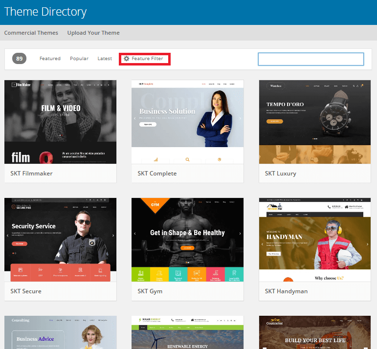
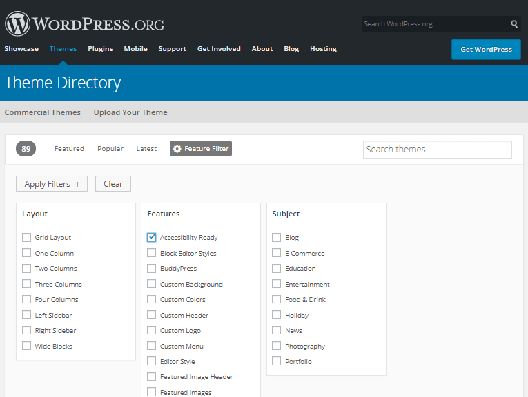
To find your desired accessibility-ready theme, you can go to the WordPress Theme Directory and use the ‘Feature Filter’ option.
After using it, the search result will provide with a lot of free themes which are particularly beneficial for the accessibility of your website. With the ‘Feature Filter’ option, you will also be able to sort the themes by Subject, Layout, and features. However, if you are looking for a specific theme, then you may also use the search bar and type in the keywords.
If you are new to this subject, then you will also be able to identify the accessibility-ready themes by searching for the ‘Accessibility Ready’ phrase in the tags section.
Make Sure That Your Navigation Menus are Responsive
As the name suggests, the navigation menus help the users of your website to use numerous features and functions. Thus, to improve the WordPress accessibility, you would have to make sure that all the navigation menus of your website are functioning in the correct way and are mobile-friendly.
Another thing, which you should do to make your website more accessible, is to position the menu items in a consistent and logical way. This will help the visually impaired users, who usually work on internet through screen-reader software, to find and use the menus in the proper manner.
You can also create some accessible dropdown menus for your WordPress theme to enhance the keyboard accessibility for the larger menus. This can prove to be quite beneficial for the people with mobility impairments, who cannot use a mouse and rather rely upon the keyboard to use the interactive functions of a page. Some of the things, which need to be accessible through the keyboard, are form fields, links, buttons, and menus.
Use Proper ALT Text for the Images of Your Site
The main purpose of the image ALT text is to describe the function as well as the appearance of the images of your website. It was designed to improve the accessibility of the website for the visually impaired people, as the screen reader software generally needs the texts to successfully interpret a picture.
Because of this reason, any of the images, which your website contains, needs to have an alt text, even if you have put in a code to display all of its features. However, the case of the background images is completely different. Thus, to make the assistive technologies avoid these images, you would have to add them by using CSS.
Make the Contents Readable
To increase the accessibility of your page, it is extremely essential to create a readable page. Thus, while composing a blog post, you should always try to keep your sentences short and straightforward. Also, it is better to avoid the abbreviation of a particular name or a term, if you have not explained them anywhere in your content.
Another way, to improve the accessibility of your website, is to use simple words and phrases in your blog. Using difficult words may create confusion among the readers and they may lose the interest of reading your blogs. You should also make sure to use larger fonts to make it easy for the screen readers, as well as the partially visually impaired people, to read and understand it correctly.
Be Careful with Color Contrast
The people, who are suffering from partial or complete color blindness, are generally unable to the words that are highlighted with the orange and red color. Some people may also find it difficult to read the texts on a background with shallow color contrast.
Thus, to avoid this difficulty, you should always use the recommended contrast ratio for the texts and graphics. These are as follows:
- Use 4:5:1 contrast ratio for the normal texts
- Opt for 3:1 ratio for the large texts
- 3:1 contrast ratio is also best for the user interface or UI components as well as the graphics
- The perfect contrast ratio for the normal texts of level AAA is 7:1 and 4:5:1 for the large texts
Organize the Structure of the Website and Content by Using Headings
Believe it or not, most of the people will usually skim your blog or content, rather than reading the whole thing. Because of this reason, using a perfect heading structure can prove to be extremely beneficial for both you as well as your user.
A good content header will not only help to make the huge text blocks to look more simple and readable for the screen-reader software but also will assist the sighted users to skip the parts which they are less interested in.
Design the Form Fields Properly
Forms are probably one of the most important parts of a website as they are usually used for numerous types of interactions, such as login, register, and contact, on the website. However, while creating the forms for their website, most of the people tend to put the field labels inside the form field to make it look more aesthetically unique.
However, doing this can affect your WordPress accessibility as most of the screen readers will not be able to access the text. Because of this reason, when you are redesigning your website for improving the accessibility, always try to keep things as simple as possible and place the form labels away from the form fields.
Use Captions on the Videos of Your Website
If your website contains any kind of video or audio file, then using captions, descriptions, and transcriptions can help you to increase your website’s accessibility rate. These captions will play an essential role for those users of your website who are suffering from hearing impairment.
However, it may also prove to be helpful for the people who can hear but are not quite familiar with the language or the accent, which have been used in the video. Some people, who want to watch the videos in a public place, will also be able to enjoy it if you have used captions and transcriptions.
Try to Avoid Autoplaying Media
Autoplaying media is known to be extremely bad for users who are dealing with cognitive impairment, as it can make them confused and cause irritation. Also, if the media file comes with audio, then it can interfere with the working process of the screen reader and can affect the user’s overall experience.
Thus, if you have any kind of media elements, which you are thinking to add, you can include it in the plugins. This way, it will not affect WordPress accessibility.
Do Not Use Fancy Fonts and Links
There is no denying that the fancy fonts look extremely gorgeous; however, it can make it harder for the partially visually impaired people to read your contents properly. Thus, most of the people generally use sans serif or serif fonts to increase the website’s accessibility.
Also, you should never use the ‘click here’ text for the links. To make the links more accessible, you would have to use descriptive and pertinent texts, which will help to illustrate the link.
Do Not Use Positive Numbers for Tab index
If you positive numbers for Tab index, then the natural tab order of your website will get messed up. This might startle your keyboard-only clients and users and affect the accessibility of your website. Because of this reason, you should never use positive values for tabindex.
The internet has become a very essential part of our life as most of us generally use it for completing numerous purposes such as socializing and shopping. Thus, to make it a better place, it is extremely essential for everyone to make their websites, including the WordPress sites, accessible to each and every person.
So, use the aforementioned tips and take the help of some accessibility testing tools to improve the user-friendliness as well as the reputation of your website.


