In WordPress, if you’re looking to hide menus of mobile then keep reading this blog
Table of Contents
You will find that most of the WordPress themes are powered with in-built styles this will help you to convert the navigation menu into a mobile menu automatically.
On your mobile phone, you might not want to use a similar menu because you might be looking after some different menu styles to get display on your mobile phones.
Below you will find two different methods to hide a Mobile Menu in WordPress are given below:
Method 1: Hide mobile menus with WordPress plugin
For beginner method 1 is recommended as they do not need to mess with coding, they just need to make use of plugins to hide the mobile menu which is by default given by the WordPress theme.
After hiding this, they can use various menus or choose to not display any menu on mobile devices.
To use the WordPress plugin, the beginner first needs to login in WordPress dashboard and then click on appearance, and then on the menu page. Here they can create a new navigation menu to showcase it on handheld devices.
Now you will find another screen where you have a new menu name so that you can recognize it when needed. Consider that you have added the name as ‘phone menu’. Now you can choose the item.
Once you have added the items to the menu, now it’s time to click on the save menu button.
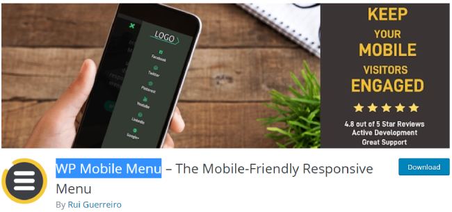
Now from the WordPress plugin repository you can choose a WP Mobile Menu – and download it. Or you can install this plugin directly from your WordPress dashboard.
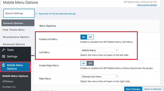
You will require going to the mobile menu page upon activation to configure the plugin settings.
Now here, you will find an option to make your Phone menu on left or right. You can set the option b toggle on or off.
Now select the phone menu that we have created earlier from the drop-down menu.
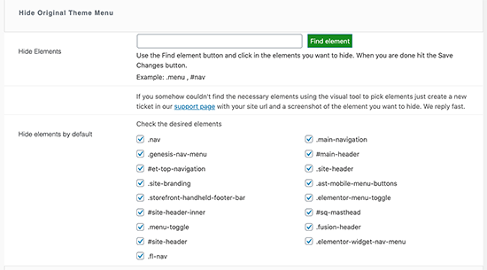
Now, scroll the page in the downwards direction until you get an option for ‘hide original theme menu’. Now this option will help you to tell the plugin that the WordPress theme’s mobile menu needs to be hidden.
As a default, the most used elements identify that is used by the mobile friendly WordPress themes will be used by plugins. Most of the website users will not need to do anything here.
Suppose, the plugin which you are using is unable to hide a Mobile Menu of your themes, then you can visit the same page again and mouse click on ‘find element’ to point to the navigation menu of your theme.
To store all your settings do not forget to save changes.
Now as we have configured using plugin now you require to tell your website that it needs to showcase the phone menu which is added by the plugin to a new menu location.
To do this:
Go to the appearance and click on the menu page.
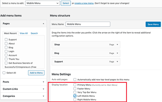
Ensure that in the drop-down menu, the phone menu that you created is selected properly. Now select the location below the menu item i.e. right mobile menu or left mobile menu.
Now check if the new menu is visible on your website or not. However, the plugin we were using will not showcase the mobile menu of your theme but it will showcase the one we created i.e. Phone menu.
The plugin that we suggested i.e. WP mobile menu plugin will help you to change the menu bar’s color, add more icons, change opacity, and much more things in the setting. You can easily and freely use such settings options.
Method 2: With the help of code, hide the mobile menu
While choosing this method to hide a Mobile Menu make sure you are experienced in coding or at least know some custom CSS.
For this method, you will have two various approaches. Either you can make the complete mobile menu invisible with the help of CSS, or else you can make individual items invisible on mobile devices.
Make your complete menu invisible on small devices with CSS
The elements that you are looking to change with the help of custom CSS code need to figure out. To perform this you will have to visit your website first and then click on the navigation menu. Now right-click on it and choose a inspect tool.
Now you will find the two different screens. One screen will display your website whereas another screen will display the source code. However, you need to adjust the browser screen to a smaller size unless the navigation menu of your desktop is not replaced with the mobile menu.
Now the CSS and identifiers used by the navigation menu of your WordPress website need to figure out. By stirring your mouse on your website’s source code you can highlight the menu area.
- Now go to the WordPress dashboard.
- Click on appearance
- Go to the customize page option to launch the theme customizer.
- Now you can go back to the ‘additional CSS’ tab and at the right corner of your admin panel click on the mobile icon.
A preview will be shown by a customizer to you that how your website is looking on phones. The CSS code mentioned below need to be added and in the preview panel, the mobile menu will disappear.
.navbar-toggle-wrapper {
display:none;
}
Ensure that you have replaced the .nav-toggle-wrapper with the identifier that your WordPress theme is using.
At the top click on the ‘publish button’ to save all changes.
Make specific menu invisible on your mobile using CSS
This is the second approach to hide a mobile menu. In this approach, you will be asked to build a navigation menu and then make the mobile menu visible or invisible on your desktop or mobile devices.
The benefit of using such a method is that you can utilize a similar navigation menu for hiding the menus on desktop or mobile phones.
- In WordPress dashboard
- Go to appearance
- Click on the menu page
- Hit the screen option button
- Just next to ‘CSS classes’ options check the box.
Until you find the menu item that you want to hide, scroll the page down. You will find an option for adding CSS class in menu item settings. Click on it and add .hide-mobile CSS class.
To hide a Mobile Menu repeat this process.
However, you can even mouse-click on menu items that you are looking to make invisible on desktop computers. Here you will need to add .hide-desktop CSS classes.
Now save the changes by clicking on the ‘save menu button’.
To hide the mobile menu you need to add the custom CSS code. For this
- Go to appearance
- Click on the customizer page
- Theme customizer will get launched
- Now click on the additional CSS tab
- And add the code given below in the CSS box
@media (min-width: 980px){
    .hide-desktop{
    display: none !important;
    }
}
    @media (max-width: 980px){
    .hide-mobile{
    display: none !important;
    }
}
Now you can check on your website if the mobile menu you were hiding is visible or not. Probably the mobile menus will be invisible because we are following the steps to hide a mobile menu.
Conclusion:
We hope the two different methods mentioned in this blog will help you to hide a mobile menu easily and efficiently.

