10 widely accepted fun ways to use surprise WordPress element in your website.
Nowadays, web design is contemporary art that can get visitors to your website as well as help you to expand your business. But, the only issue that a web designer faces is how to make it stand out from other websites.
Table of Contents
Visitors tend to appreciate predictability and consistency in the websites, but adding up some element of surprise on your website can make your website stand out from the other websites.
As a designer, you need to follow that too much use of surprise WordPress element or irrelevant use of surprise element will be a bad step that can also distract your visitors. There are several other ways to give your audience a little surprise and wake them up from their expectations.
1. Include a Hidden Message in your Web Design
You may be surprised to know that every brand’s logo has a meaning or hidden message and this is considered to be the best way to add a surprise WordPress element to your website design. If you are designing a website, then think about how to add hidden messages or brand-related info-graphics logo into your website design.
A successful web designer always tries to use info-graphics into the website as it attracts more people to visit the website and spend more time on it.
Visual learning is the best way to understand something for example if you make an informative logo or info-graphics then visitors will easily understand the process of your company or what your company deals in.
Ex. LG hidden in the logo, L making the nose and G marking the outline of the face. But according to the company’s thought process, the logo speaks louder about their aspirations to maintain a happy human relation with its customers.
2. Hide Something in Noticeable Spot
If you are thinking to hide something in a noticeable spot on your web page then an Easter egg is the best option for you. It is mainly used for entertainment purpose but it can also be used as a contact form on your website.
Many people deliberately skip the regular contact form due to its monotony, but this surprise contact form can attract them and sign up. More sign up means the probability of getting more potential customers for your business.
3. Hide Something in your Source Code
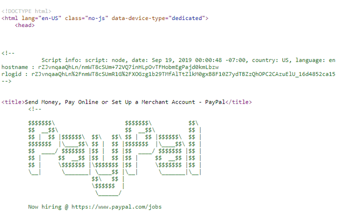
As a developer, you may have the idea that writing clean and simple codes are the main key point to build a website. Hiding some surprise WordPress element into your source code might not be mandatory for every website but it might be just a fun thing for you.
Ex. PayPal Source Code
4. Add Some Entertainment in Your Website
The era of monotonous web designing is gone in this generation if your website is not entertaining or attracting then you are simply not in the run. As a designer, you just need to add some entertainment to your website to increase visitors to your website.
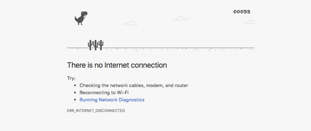
The best example of entertainment for your website is adding some games for your visitors when the page is loading or the connection is lost. In other words, just try to add something that will let your visitor cling to your page for a long time without any boredom.
5. Celebrity Endorsement
Celebrity endorsement has now become a trend for many businesses and websites as it has the power to attract more audience to your website. Studies have shown that celebrities have the power to attract people; celebrity endorsement could easily help in the expansion of your business.
However, celebrity endorsement is nothing but a promotion of your website and business. For example, when you see your favorite musician promote any musical instrument brand then you are also eager to know about the brand and the products they are offering to its customers.
6. Explain the Deal in a Pop-up
This is another simple way to add a surprise WordPress element to your website design and it is mainly suitable for e-commerce brands. You may have observed that some e-commerce brands give a discount or offer to some of its customers, not to everyone.
E-commerce brands mainly use pop-ups and hello bars that will make their customers subscribe to their brand and after that offers or discounts will be announced. In recent times, this method is helping many brands to grow effectively in their fields and attracting more consumers for them.
7. Humorous Touch to the bios
You may have noticed that About Page of many websites are dull and stereotype that is the reason most visitors skip this content. As a designer, you just need to change the way of presentation for your ‘About Page’ just try to make it informative yet attractive.
If you want your visitor to read the about page your company then try some elements of surprise or some information apart from your company’s business. As a developer, you can also add some interactive animations on the elements of your company’s about page.
8. Give Unique Scrolling Effect on your Website
Everyone is familiar with the static web design and often loses interest to surf those static websites. As a web designer, you just need to include something different on your website to increase the rate of viewers for your website.
Visitors or viewers are the future potential customers of your brand so it is important to attract more visitors to expand your business. Adding a non-traditional scrolling option rather than the default options can do this effectively.
Several CSS animation tools provide a wide range of scrolling transition effects to choose from, and some of the CSS animation tools are open source means they will not charge you any money to use it. You just need to check every effect and choose a suitable scrolling effect for your website that will surprise and attract visitors to visit your website.
9. Make your website device Friendly
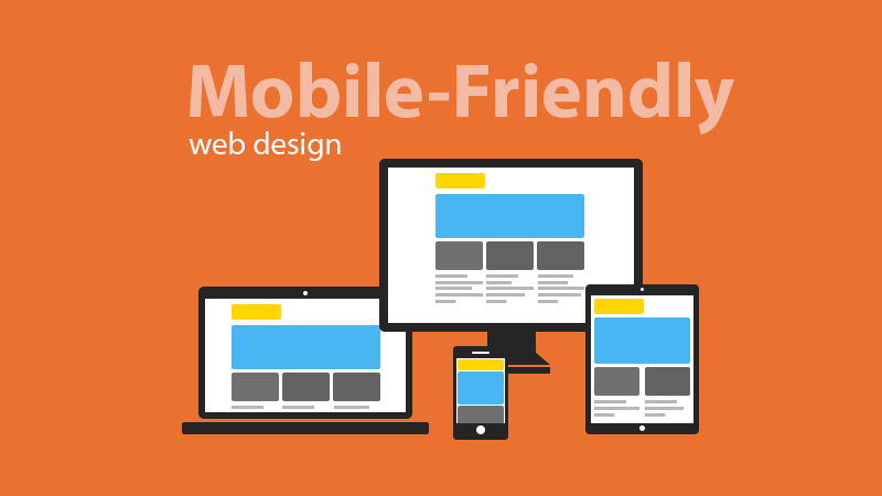
Nowadays most of the people visit your website through their smartphones as it is easily accessible. The traffic and engagement received by internet-savvy via smartphones are remarkable in this era of modernization.
If your website is not mobile-friendly then there is a major chance of losing potential customers for your business. If your website is mobile-friendly then you will observe a huge footfall on your website and some of the visitors can be converted into your customer.
10. Use Interactive CTA to your website
CTA or call to action is another important element for your website that will enable the visitors to directly contact with the business. This is the best area where you can add some surprise WordPress element for your webpage to attract more visitors.
If the design of the website has impressed the visitors enough, then they will get the eagerness to click on the CTA to directly contact with your business.
But you need to keep in mind that overuse of surprise elements in CTA can also hinder your visitors from visiting your website. CTA is nothing but a temptation to take action just to experience where it is taking you.
Checkout our article on why every post should end with call to action.
There are several other ways to use the element of surprise in your page but the above-discussed ways are reported to produce effective outcomes.
One thing you need to consider before designing a website, that negative feedback for your website can be directly linked with the website design. Web designing is not just an art; it is a marketing skill and a platform that will effectively promote your business to the world.


