In 2022, about half of all online purchases were conducted on mobile devices according to marketing research firm Gartner.
Table of Contents
Considering that half of mobile visitors will hit the back button if a website takes longer than 3 seconds to load, prioritizing speed is pivotal to keeping up with your competition.
Below are some steps web developers can take to speed up their WordPress site for mobile visitors in 2022 and beyond.
Why Every Millisecond Counts
The longer your WordPress site takes to load, the more potential customers you will lose. Since Google now takes page speed into account for mobile search rankings, making your website faster also improves your chances of reaching new people.
In fact, Google is gradually moving toward “mobile-first” indexing, which means that its search algorithms will use mobile versions of websites to determine overall search rankings.
Google recommends aiming for load times under a second for mobile sites. While that may not be a realistic goal for all developers, load times above 2 seconds are considered unacceptable for e-commerce websites in 2022.

Before you start optimizing your pages, conduct some speed tests and establish some benchmarks. Google’s Speed Scorecard can show you how your site’s mobile speed compares to your competitors.
If you have a retail website, Google’s Impact Calculator can help you estimate how much revenue you stand to gain by improving your mobile speed by just a few seconds.
Whenever you make a major change, run some more tests to see if it made an impact. If you can make your website load in less than 5 seconds over a slow 3G connection, then most of your users will be happy.
Tips for Making Your WordPress Site Faster
1. Make Your Website Responsive
Mobile users have different expectations than desktop users. For example, someone shopping on their smartphone may care less about image quality than how quickly they can complete a transaction.
Therefore, it could actually be beneficial to deliver slightly lower resolution images to your mobile visitors. High resolution images are especially important for online stores, but they can drive away mobile users who are paying for every byte of data they receive.
Therefore, you must implement responsive web design to accommodate all users by delivering assets site optimized for mobile speed for their device.
Certain WordPress themes and plugins makes it easy to prioritize content visibility for different users. Simply go to the responsive options in your WordPress template to customize what your mobile visitors can see.
You can hide larger images and other content that mobile users don’t necessarily care about.
Otherwise, if your theme or plugin doesn’t have a responsive option you can hide certain visual elements of a page by using media queries.
You can define these in your CSS file and hide or show certain elements of a page based on the size of the viewport. For example, the following snippet will hide the CSS class .big_image if the viewport is below 480px in size:
@media screen and (max-width: 480px) {
    .big_image {
        display:none;
    }
}
2. Sign Up With a Content Delivery Network Provider
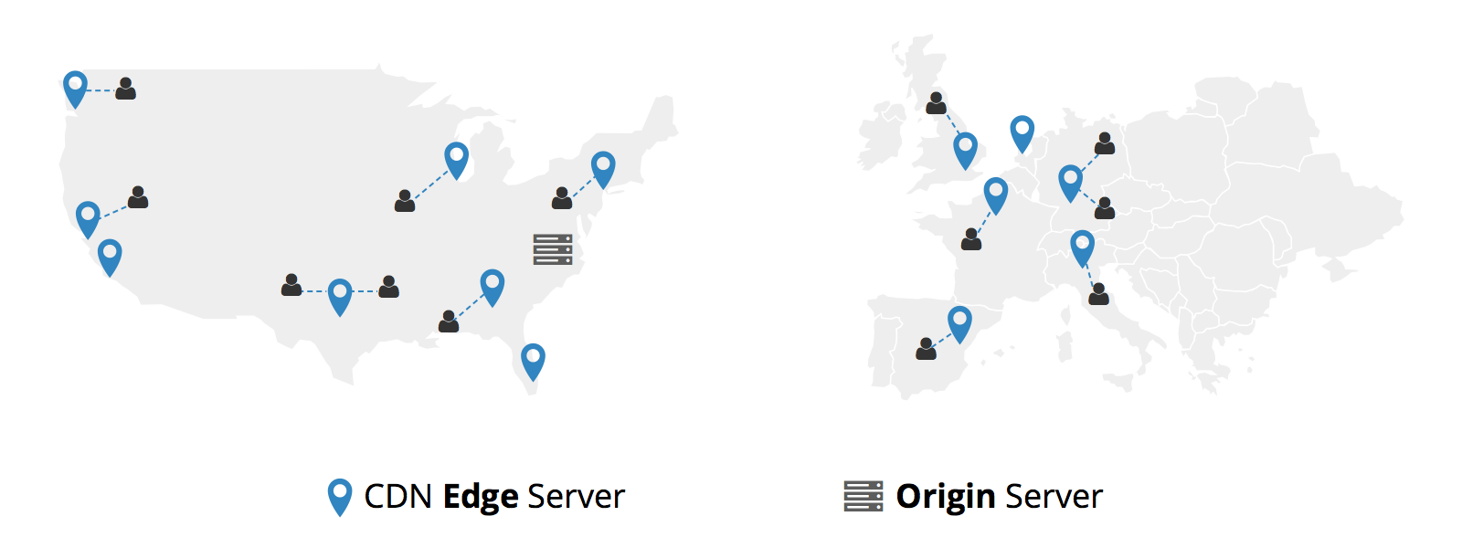
The simplest way to site optimized for mobile speed all aspects of your website’s performance is to invest in a CDN, or content delivery network. CDNs are networks of servers placed strategically around the world.
These servers, known as points of presence, host copies of your website to ensure that visitors near and far have a consistent user experience.
When users from other countries request your website, the CDN will deliver your content via the point-of-presence that is geographically closest to them. CDNs also optimize caching so that your pages load even faster for users on return visits.
Aside from reducing the time-to-first-byte, a CDN can offload resources from your host server during busy times so that users don’t experience interruptions due to traffic spikes.
Because copies of your site are stored on servers around the world, using a CDN can ensure that your site never crashes. If one server fails, the CDN will reroute visitors to the next nearest point of presence.
Other benefits of using a CDN service include protection against DDoS attacks, improving SEO, and more. Investing in a CDN also simplifies scaling since your website is already distributed globally.
3. Optimize Your Images
Speaking of which, now may be a perfect time to transition from using traditional image formats like JPEG and GIF to a more efficient alternative like WebP.
This newer format utilizes better compression algorithms than its predecessors, so higher quality images can fit into smaller files.
Thus, converting your images can result in faster load times for most visitors. Novel image formats are not yet supported by all browsers, but you should still provide the option.
Images often make up the bulk of a website’s weight, so anything you can do to optimize them will have a positive effect on page speed.
Take advantage of HTTP caching directives to make unchanging elements on your website load faster for returning users.
4. Use the AMP Plugin
Google AMP is an open-source framework that optimizes websites for mobile devices. The AMP WordPress plugin facilitates responsive web design by allowing you to serve a “stripped down” version of your website to mobile visitors.
Research conducted by Forrester found that AMP boosted mobile conversions by 20 percent for e-commerce websites.
5. Optimize CSS and JavaScript Delivery
Inlining small bits of JavaScript and CSS in your HTML markup can help prevent delays and blocking. Google PageSpeed Insights can help you identify render-blocking code, and there are dozens of plugins that offer JavaScript and CSS optimization such as Autoptimize.
Related Post: 8 Effective Ways to Increase Your Mobile Conversion Rate
6. Optimize Your Themes and Plugins
Sometimes themes and plugins can be the culprits behind performance bottlenecks. Make sure everything you’re using is current by regularly checking for new updates.
If you suspect one of your plugins is causing issues, try deactivating them one-by-one on a staging site until you pinpoint the problem. If you’re using a custom theme, try switching to one of the default WordPress themes to see if it makes a difference.
7. Install a Caching Plugin
Installing a caching plugin allows for your WordPress site to be cached even further resulting in even better load times than if you were just using a CDN alone.
Plugins like Cache Enabler automatically create static HTML versions of your pages therefore there are no PHP processes that need to take place when a page loads. This means a decrease in latency and happier mobile visitors.
Summary
Site optimized for mobile speed isn’t a one-and-done endeavor; it’s a never-ending race toward a goal post that keeps moving.
As your site grows and attracts more visitors, use analytics to measure how those changes impact performance. Stay abreast of new WordPress plugins and updates so that you can keep up with users’ evolving expectations.

