Within months of launch of Wordpress 3.7.1 now WordPress comes with yet another launch.
With 2014 coming in they with this Wordpress 3.8 launch also launched Twenty Fourteen Theme as well.
Wordpress 3.8 is named after Charlie Parker who was inventor of bebop style of jazz music.
In this release Wordpress team focuses on the backend of WordPress and have made it easier to load with lesser box shadows, lesser gradient and more bigger and better font for easy viewing from human eye.
Here are some of the feature updates included with this release:

source: WordPress.org
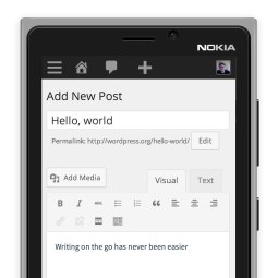
1. Wordpress Admin Panel becomes mobile responsive.
It was long due for WordPress admin panel to make itself responsive from the backend point of view. With Twenty Twelve and Twenty Thirteen themes already responsive the front end of WordPress was easily viewable from mobile and tablet devices.
But the admin panel was difficult to manage from tablets or mobiles and hence this version made it responsive.
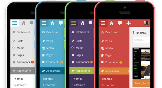
2. Wordpress admin panel becomes colourful.

source: WordPress.org
With many colors to choose from Wordpress has followed the trend of Nokia Lumia and Apple iPhone 5c to make its dashboard colourful. Choose the color which suits your liking.
3. Admin panel becomes easier to load with lesser gradient effects, lesser boxy shadows.
Admin panel has to load quicker and faster which was well understood by Wordpress team this time and hence they opted for simpler design and lesser gradient and shadow effects to make admin panel load faster
4. Typography got improved.
Fonts used within admin panel got bolder, clearer and better.
5. Admin panel got cleaner.
With this modern interface the admin panel got a lot cleaner than its previous WordPress versions.
6. Theme management got easier.
Earlier themes had their descriptions under the theme and we couldn’t check it fully. Now theme management is much more easier where one can read each theme description one by one and then preview the theme and select which one to apply.

Wordpress team came up with a very nice Twenty Fourteen Theme with grid layout and magazine style which makes the theme quite good looking due to the pictures but keeps it simpler in terms of look and feel.
Needless to say all of our themes at SKT Themes are compatible with the latest version of Wordpress.
